Eight’s New Look

We are committed to ensuring that every user has a great experience using Eight. That’s why today we are excited to announce the release of a new User Interface(UI) that will improve your experience and efficiency using Eight.
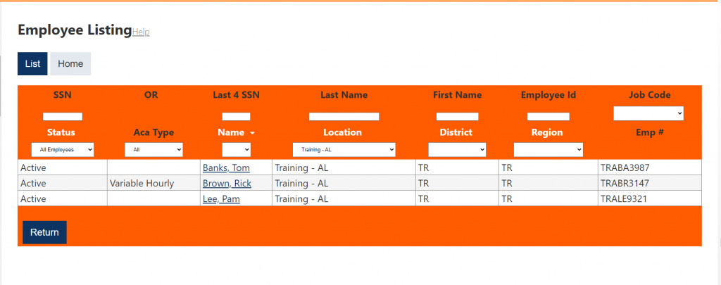
We’ve updated the look and feel of Eight with a new font and styles. These new styles are not only pleasing to the eye, but are designed to make it easier and more efficient to navigate the system. For example, rows and columns are now outlined within list screens like My Task and Employee Listing.

Additionally, the pages are now designed to dynamically adjust to the device to which you are using. Page layouts will be more consistent for you across the various types of devices you chose to access Eight.
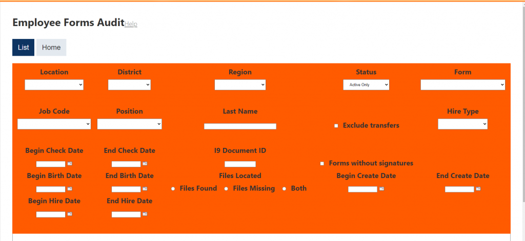
The form and function remains the same, so users should not have issue with the normal use and flow of Eight. The biggest difference, besides the font and styles, will be the List button. The List button, within for example All Task or Employee Listing, is now prominently located at the top of the page, above the orange filters; as opposed to being hidden within the orange filter frames.

